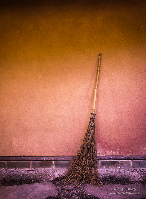
Portland Japanese garden
As a photographer one of your jobs is to always look for the different view, the unnoticed detail, the obvious seen in a new light. But that isn’t always simple or easy. We get trained and accustomed to seeing the overall picture, the big view and forget that it is the details that add life and meaning to what we’re seeing.
While visiting the Japanese garden in Portland a few weeks ago I found myself after two days of intensive shooting realizing that I had spent most of my time getting the big picture, the wide views of the ponds and paths and trees and the larger scenes the gardener had designed for us to notice as we strolled through the garden, and although they were breathtakingly beautiful I found that I was seeing the garden from a distance, I was missing the details that add character and texture to the garden. I wasn’t as immersed in the experience as I wanted to be.
I needed to go back through and find the small things that made this extraordinary place unique. I needed detail. When you’re visiting a place like a Japanese garden there is so much going on that everything you see is blended together. The overview and the details are blended together in such a way to make the total picture complete, that you don’t focus on the small parts that complete the view, they’re just there. There would be an empty space you would feel more than see if they were gone, that is by design. Yet that is part of the photographers problem, he has to be able to notice those details then isolate them in a meaningful way. That’s where the photographer’s eye comes in.
To do that we have to borrow a phrase from the politicians handbook and use the “KISS” method, or “Keep It Simple, Stupid”. All this means is that as you observe various details that your eye may have glanced over before, you begin to isolate that particular part of the overall view and try and present it in a way that makes it meaningful and interesting at the same time. And the best way to accomplish that is to keep it simple. Remove anything that may distract the viewer from seeing the essence of the detail and let it speak for itself. The resulting picture can often give the viewer an emotional connection to the place that isn’t always in the larger views.
I chose this image of a broom leaning against the wall for several reasons. It is iconic to a Japanese garden, I love the mood it sets up against the wall, and the third is for a more personal reason. When I was in Japan visiting the various temples and gardens there, I would notice the monks sweeping the temple grounds with these brooms. It was usually an older monk or a very young one doing the sweeping. Never a monk in the middle, if you will, I asked one of them about it and was told that they didn’t use a younger man because they did too good of a job. The result was too perfect, there wasn’t the missed leaf laying against the stone to catch your eye and draw it to the beauty of the individual, or the build up of them along the walls and walkways left there by the sweeper as he made his way along the path. The details that we would take in but not see if you will, but made the whole better, more complete. The older monks knew it didn’t matter if they missed a few and the younger ones didn’t know the difference yet. The overall effect completed the harmony.
Seeing that broom against the wall brought back those memories. A simple view but a good one.


You must be logged in to post a comment.